

Welcome to another edition of the Marvel Rundown! Once again The Beat’s crack team of Marvel experts breakdown the House of Idea’s latest books. Our main review is focuses on the first issue of the latest series featuring Marvel’s Daywalker Blade. Meanwhile our Rapid Rundown looks at the next step in “From the Ashes” debuts with Sentinels #1, the Fantastic Four get stuck in a hole, and we continue our coverage of The Ultimates.
The Beat wants to hear from you, True Believers! Tell us what you think of this week’s Marvel Comics! Shout us out in the comment section below or over on social media @comicsbeat, and let us know what’s good and what’s not so good!
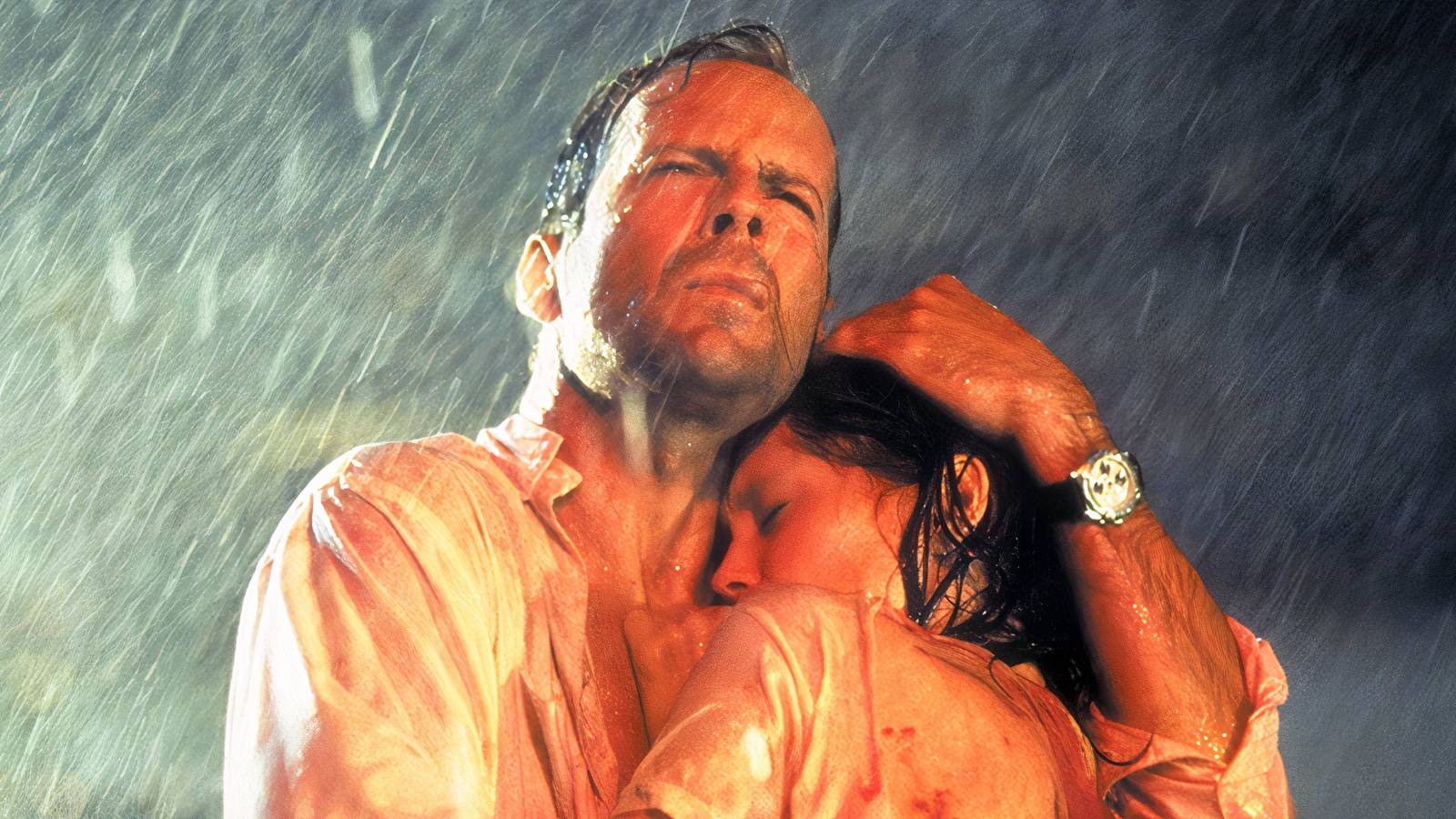
Blade: Red Band #1
Writer: Bryan Hill
Artist: C.F. Villa
Colorist: Java Tartaglia
Letterer: VC’s Clayton Cowles
One has to appreciate Marvel going all in on their new Red Band format. Introduced during the Blood Hunt event, certain Marvel books are getting ultra violent editions books (ie. Wolverine: Revenge) or just coming out as Red Band books (ie. Werewolf by Night). Our own Beau Q. asked in their review of Werewolf by Night #1 what differentiated it from Marvel’s MAX line. It’s a good question especially when there’s almost little to differentiate other than as they said “2 to 3 pages of pretty tame violence”.
So far the Red Band books seem to be Marvel’s version of something from the VHS/DVD era; “unrated editions”. You could get theatrical cuts of movies or you could get version that potentially had more violence and sex in them. Generally, it could be barely noticeable amounting to a few more seconds of gore in a horror movie or a slightly longer sex scene. With these books for now, Marvel just seem to use it as a marketing tactic especially with their horror books at the moment.
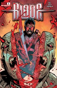
The cover for the latest Blade series almost promises something truly brutal. Look at cover by artist C.F. Villa and colorist Java Tartaglia! Blade chops a guy straight down the middle! That cover is how you sell a book. The interior contents are definitely bloodier than saw an issue of Amazing Spider-Man. Villa gets to draw some beheadings and the final splash page is pretty gruesome (heads on pikes!) but honestly none of it is truly off putting. It’s violent enough for a Marvel comic but not ultra violent on the level of say a chapter of Berserk or an issue of Invincible. That said if the late Kentaro Miura did draw a Blade comic, it would probably look bloody amazing.
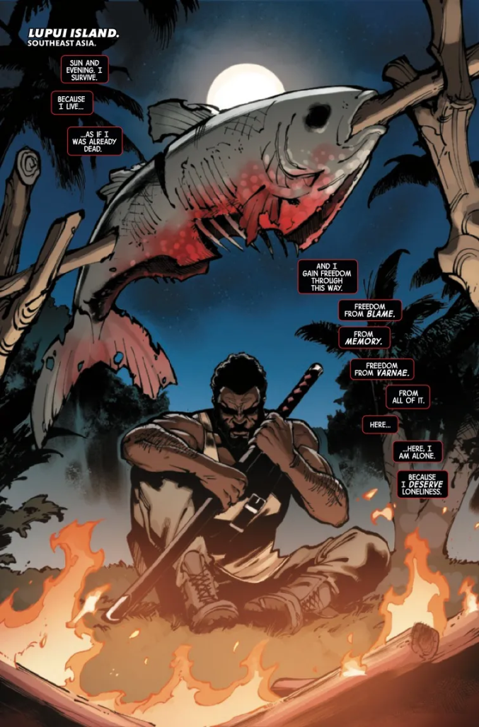
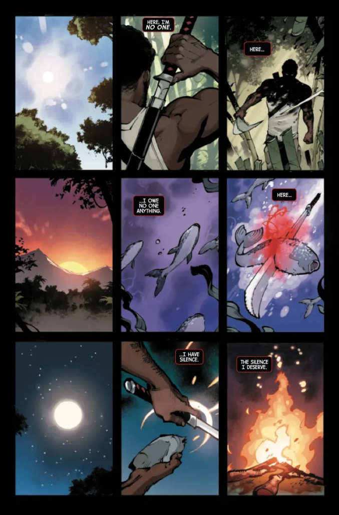
Spinning out of Blood Hunt, Blade now isolates himself from the world. He now lives on an island and spends most of his time making swords as some sort of penance. Getting possessed by the spirit of the first vampire and causing a near vampire apocalypse does that to a person. Of course no one can leave him alone and once again, everyone’s favorite Daywalker has to kill, you guessed it dracu- uh vampires.
The script by Bryan Hill script very much casts Blade as an old mercenary being dragged out of retirement for one last mission. If you guessed that Blade doesn’t play along with this request, give yourself a No Prize. The only real wrinkle in this predictable set up is that Blade isn’t interested in anyone using him as a tool, especially after Blood Hunt. Hill gets the character down perfectly. You can picture Wesley Snipes delivering this dialogue. It’s a shame he can’t think of a more interesting set up after the early pages to explore for this issue. The character is stuff here is fun but so far nothing in this story really gets the blood pumping.
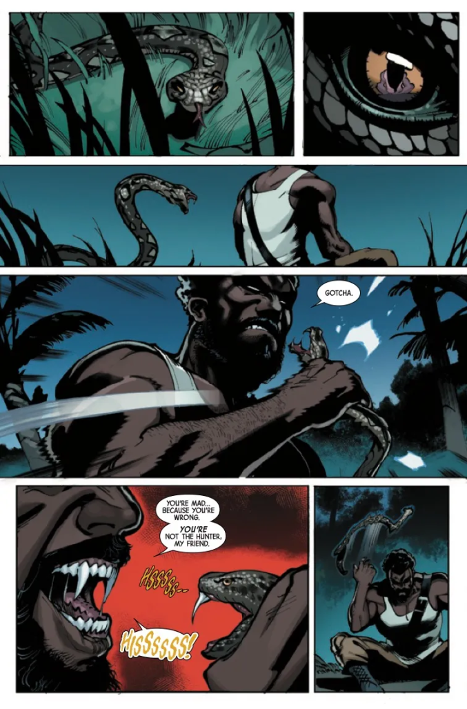
Villa makes this look more exciting than it actually reads. Their art here nails the action beats with a real commitment to a grid. Even if not every page looks like it, they all function on a grid making it easy to follow the action. This is an artist with a real design sense to their storytelling. But also Villa just enjoys drawing Blade hacking and slashing his way through enemies. This comic may not reach the levels of ultra violence that one wants from a book labeled “Red Band” but there’s a satisfaction to this character beheading and dismembering monsters. It’s a shame that Java Tartaglia’s colors are too literal and not a little livelier.
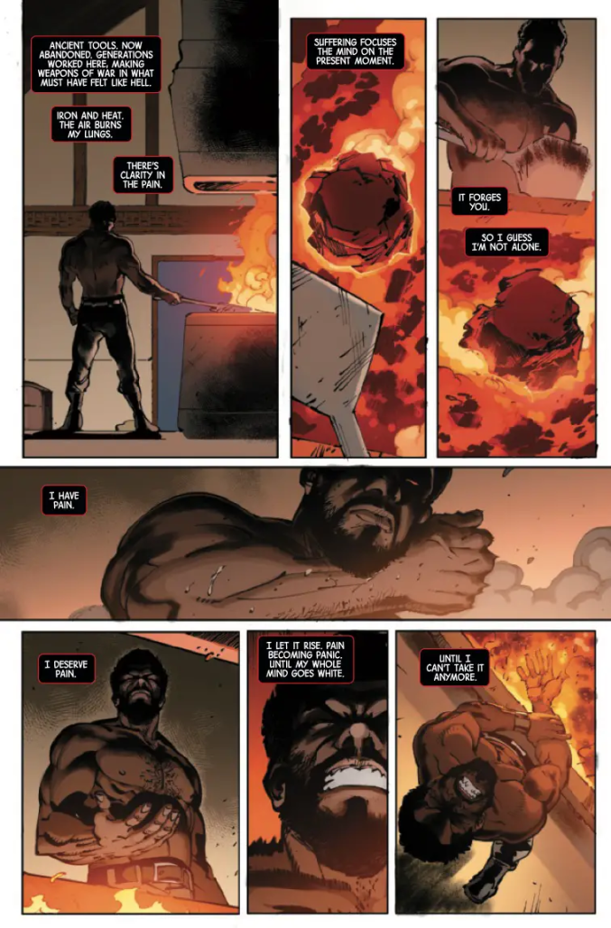
Still nothing in the interiors lives up to the promise of that cover in this first issue. That cover promises something really nasty especially for something put out as a Red Band book. Blade does get to slice and dice some monsters, kind of brutally. Nothing in this book though feels nearly as dangerous as a cover that looks that gnarly.
Verdict: BROWSE
Rapid Rundown
- Sentinels #1
- Sentinels from writer Alex Paknadel and artist Justin Mason has been my most anticipated new title from the ever-expanding X-Men line. This is for two reasons: One, Paknadel is among the most interesting and salient writers working in comics today. His creator-owned series with Caspar Wijngard, All Against All, is a horrifically beautiful satire of violence and capital. I hoped that same sensibility would translate to this comic. There was some sturm and drang on social media when Sentinels was first announced, with people upset that Marvel would spotlight or celebrate the oppressors after scattering the nation of Krakoa and putting mutants back into a fractured minority. This, of course, was a silly concern given Paknadel’s body of work. My concern was more about the writer working within the constraints of a publishing apparatus that shies away from controversy. But this first issue is an excellent start. From a pure craft standpoint, Paknadel manages to balance exposition, continuity callbacks, and character building without the book ever getting weighed down. He drops us off at the start of a mission, and through the Sentinels’ daily grind, we become more exposed to their powers, their mission, and their threats. Justin Mason’s art is grungy and visceral. Characters look beat up, grizzled, and like they are being eaten away from the inside. Federico Blee’s colors are restrained and sterile–these Sentinel soldiers are prisoners and science experiments and the book traps them visually. VC Travis Lanham does a decent job but some of the caption boxes have some rough font choices that make the setting hard to read, but it’s a minor factor. As good as its first issue is, this book might be a tough sell. The art is not as slick and pretty as the X-Men house style has become, there are no familiar anchor characters, and these are complex characters doing unpleasant things, being treated with complexity and humanity. But Paknadel’s use of Sentinels-as-cops is an unsubtle and rich metaphor to investigate tough issues like the structural and social costs of authoritarianism in the way superhero comics are so good at doing. There is potential here for something special if Marvel is bold enough to commit to it and readers are willing to get uncomfortable. – TR
- The Ultimates #5
- This latest incarnation of The Ultimates hasn’t blown me away, but this issue has done a lot of heavy lifting in me reconsidering my opinion of the title. The Ultimate line has this 14-month suspense built in the ticking bomb of the Maker’s return, and that’s where Iron Lad, aka Tony Stark, prepares for him by assembling the people who would have been heroes into this team of Ultimates. Writer Deniz Camp’s newest recruit is the avenging archer Hawkeye, but not the dysfunctional Clint Barton we’ve known for decades, this Hawkeye is an Indigenous resistance fighter of a different sort than what the Ultimates were initially looking for, Camp’s spin is a fresh take on the hotheaded archer and his relationship with Cap, the reveal of his real name is a great moment between them. Juan Frigeri’s solid art and design work make this book move with real fun and funky energy as the two do the initial hero fight leading up to the big battle with the bad guys. What I have come to like most about this run is its funky remix of John Byrne’s first year of Alpha Flight, a team book where readers don’t get to see the team until the last two issues. I’m curious to see what’s next in the countdown to the Maker’s return. – GC3
- Fantastic Four #26
- This is a comic where Reed Richards and Johnny Storm get sweaty trying to unplug and plug a hole in their basement; shirts off, jeans and boots on. You are now equipped with enough knowledge to make a purchasing decision on this fantastic issue. If not, you may be familiar with the time this issue’s writer, Ryan North, got stuck in a hole, and twittered his way out, because this issue reads like a mental transcript of the two wolves inside North. North’s ability to pen a Reed-driven story where the dude isn’t a sociopathic tool in his science driven quests is effortless here. It’s refreshing to see the untapped camaraderie of Reed/Johnny when the book is essentially “the scientific method applied in the vicinity of an idiot.” Ivan Fiorelli efficiently renders the complicated visuals into a relaxing breeze without missing a comedic beat. There’s a fun dichotomy here of Reed & Johnny’s wilder moments depicted with slanted panels juxtapose level panels for their calmer moments– just one Easter egg of many Fiorelli uses to communicate to readers…and yes, Reed has yaoi hands. Brian Reber may have had the difficult task of rendering multiple shirtless characters in different lighting, but by keeping the light sources singular, it essentially gave him a north star to follow when switching up the palette. There might not be so much moodlighting in FF #26, but Reber keeps the spectral glow festive and natural rather than harshly contrasting with the issue’s color key; that’s dope as hell! VC’s Joe Caramagna had the unenviable task of stuffing North’s wordy balloons in panels Fiorelli leaves with little to no negative space– the result is unbelievably breezy and did not require moments of pinch-zoom. Where Caramagna falters, if that, is in matching sfx aesthetic to Fiorelli’s imagery, but given some production leeway, I believe these sfx would appear less tacked on. Anyway, do yourself a favor and go pick up this instant classic done-in-one! — Beau Q
Next Week: We’re doing a roundtable on Mystique #1 and Moon Knight: Fist of Khonshu!


